In the era of “branding”, you’ll see me using my monogram everywhere from my curriculum vitae to all over social media. But there’s a story behind it!
I was in my late teens when I first became infatuated with learning about computers, programming, the Internet, and technology at large. Studying these areas was my reprieve from the horrible experiences I had in high school. Although I had/have absolutely no artistic talent, I thought that maybe one day in the future, having a logo might serve as a cornerstone for my professional portfolio.
But where to begin?
My lack of creativity helped me arrive at an obvious choice – my initials! So I wrote out “R.K.” on a piece of paper (remember, this pre-dates any fancy iPad or smartphone)… and I was already disappointed. It was too plain. It wasn’t good enough. And with no artistic ability, I had nothing to fall back on.
Around the same time, my web development skills were growing rapidly, and I started thinking: “Hmm, I need a favicon.” Favicons are icons associated with websites that you’ll see when you bookmark a webpage or save it to your desktop. So what does this have to do with my logo? Well, favicons need to be square images (typically 16 x 16 pixels). When I wrote out my initials, I just couldn’t find a way to make them sit next to each other so they a.) looked nice and b.) could be resized into a square icon.
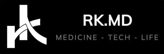
When I typed out “RK” in sans-serif fonts, I noticed how the letters share two major characteristics: a vertical line on the left and a diagonal line extending from the middle of the character to the bottom right. What if I could merge these two letters into a singular image that conforms to square dimensions? I also looked at the lowercase equivalent (“rk”), and wondered if I could merge this more seamlessly.
I sketched samples on paper, and then turned to Microsoft Paint (later Adobe Photoshop) to construct the exact monogram I use today. A part of me feels incredibly nostalgic thinking that teenage Rishi created something for adult Rishi to use for the rest of his career. It reminds me how far I’ve come! 🙂


The “K” reminds me of thoracic aorta with SMA, and the “r” resembles IVC with L renal vein. The renal vein is even passing under the SMA!
Hahahaha, amazing analogy!