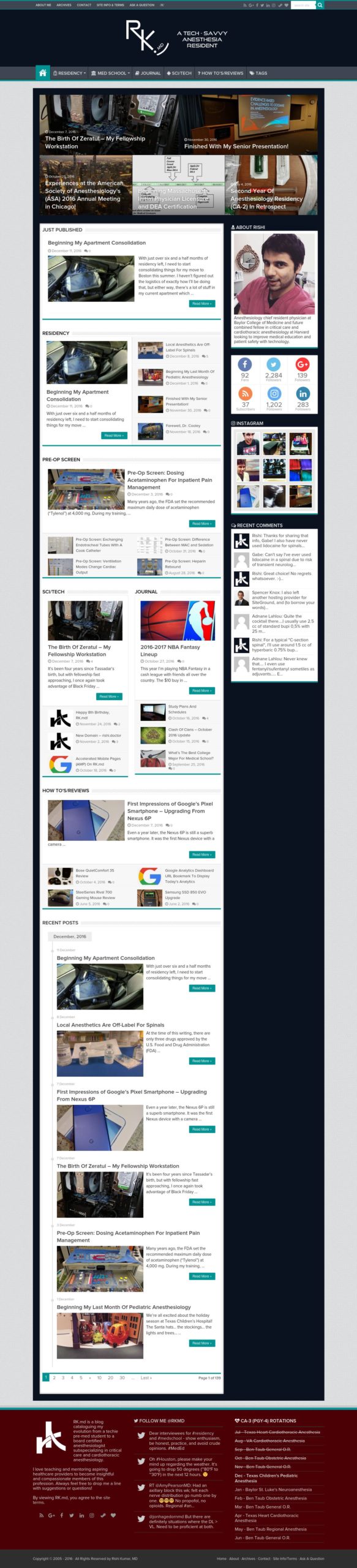
I wanted to catalog some changes I made throughout the year of 2016 on RK.MD.
My objectives were:
- Creation and utilization of negative space while shrinking the color scheme
- Reverting back to Google fonts (Open Sans, FTW)
- Changing my header image to reflect my imminent completion of anesthesiology residency (~6 more months!)
- Changing my grid display of featured posts into a full-width slider
- Simplifying the overall layout by listing only the most recent posts
- Transforming my Instagram widget into a scroller at the footer
- Cleaning up the footer
Overall, I just wanted to clean things up a bit. 🙂
Click on the following images and click on the “view full size” link in the lightbox. I’ll be making some slight tweaks here and there in the coming days, but in the interim, let me know what you think – the good, the bad, and other suggestions! Oh, and here’s a post about my site from back in 2012. 😀